A Rhapsody in Blue and Green
Coating manufacturers have picked their 2020 Colors of the Year and the results reveal important trends for shops to follow.
It’s that time of year again. Interior designers and coatings companies are all busy picking trend colors for 2020. And this is something that woodshops watch because more than half the casework we build nowadays is solid color.
AkzoNobel’s Color of the Year for 2020 is called Tranquil Dawn. It’s “designed to capture the essence of what makes us human as the dawn of a new decade arrives”. The company says that it’s a delicate, fluid shade somewhere between green, blue and grey.
“Tranquil Dawn perfectly captures the 2020 mood of what makes us human,” explains Heleen van Gent, head of AkzoNobel’s Global Aesthetic Center, the body that leads the annual trend research. “It’s reminiscent of the colors of the morning sky and encapsulates our desire to treasure our most human qualities.”
Hard-nosed, skeptical woodworkers may have a hard time translating such sentiment, but the bottom line here is that these experts can really zone in on what’s trending, and what’s already popular. A woodshop needs to be aware of where its customer base is going, and perhaps be ready to follow.
Social media has had a profound impact on mass trending. The speed and scale at which tastes can change is startling. What used to be done with swatches and catalogs over months, if not years, is now done in just days, and sometimes hours. The results are truly global, too. Think about this – last December, Facebook claimed that it had more than 2.3 billion monthly active users. That’s one in every three people on the planet. Add in other platforms such as Pinterest and Twitter, and trending has taken on a whole new meaning.
Sherwin-Williams’ 2020 Color of the Year is Naval SW 6244. This is a rich navy that “creates a calm and grounding environment infused with quiet confidence,” according to the company.
Behr’s 2020 Color of The Year is called Back to Nature S340-4, which the company describes as calm, gracious and balanced.
PPG Paints’ 2020 pick is Chinese Porcelain, “a blend of cobalt and moody, ink blue that imparts calmness and restful sleep while also offering the spirit of hopefulness – a rare commodity in a restless world,” according to the company.
Pantone has weighed in with a full palette of colors for 2020, and in keeping with the rest of the industry experts it has included Classic Blue, a teal toned Mosaic Blue, Biscay Green (described as having a hint of cleansing waters) and Chive, along with some warmer accent tones such as Coral Pink and Saffron.
So, the bottom line as far as woodshops are concerned? Your most trend-conscious customers are quite probably going to start looking for topcoats that are soft blues and greens, or combinations of both, over the next few months. That’s especially true in markets where interior designers have a heavier hand. Institutional designers tend to be a bit behind the residential trend, in part because of the larger scale of their projects and the longer timelines that requires, so they may come on board in another year or so. Foil and laminate manufacturers also pay attention to the color experts, so shop-applied coatings may need to match up with those.
Looking backward?
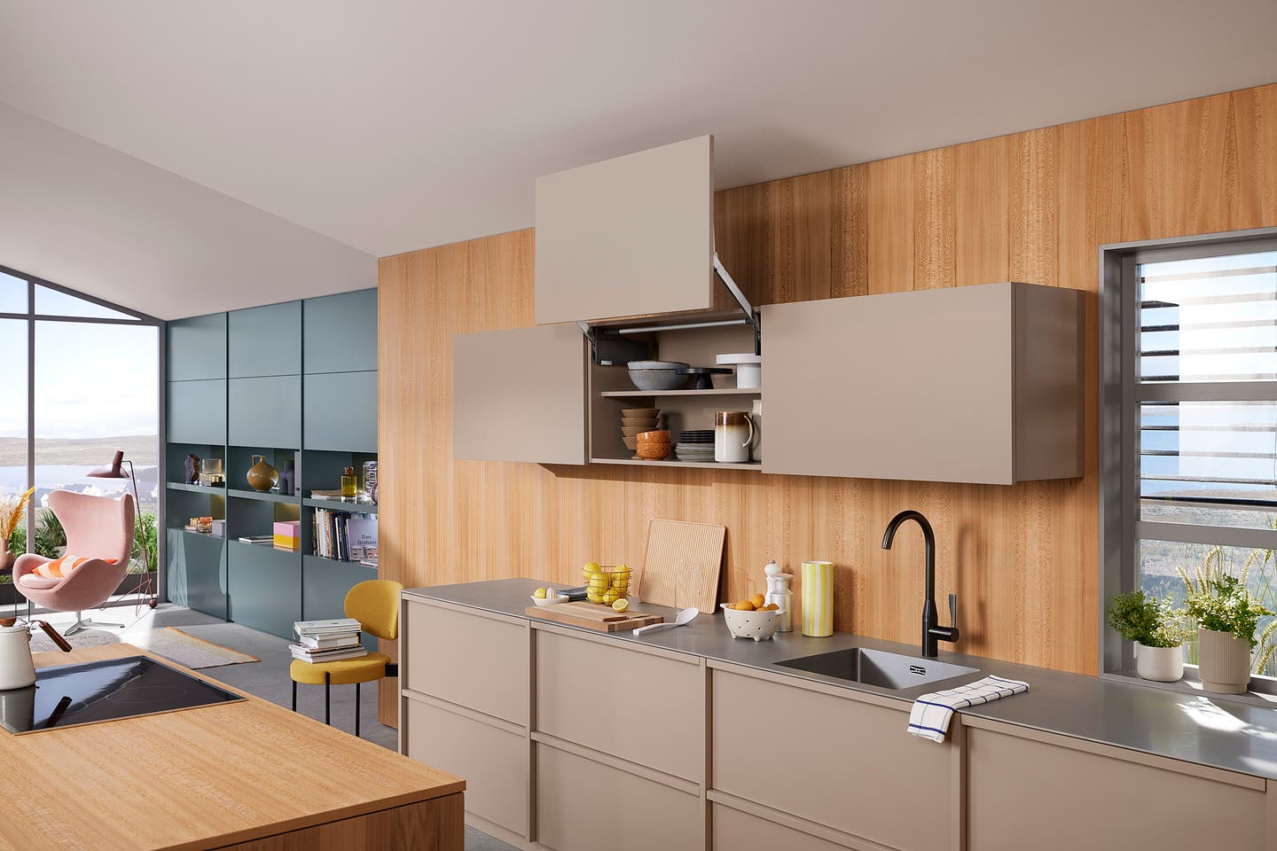
While many designers rely on solid wood or lookalike laminate flooring to warm up a room full of colored casework, others are beginning to use natural wood tones in vertical, rather than horizontal planes.
Paint and solid colors are still the rage, but something subtle is beginning to happen in kitchens and baths. Natural surfaces are returning – not walls of your Grandma’s red oak plainsawn cabinets, but the limited use of wood tones as accents. They’re popping up as short lengths of countertop, end-grain butcherblock, or even entire old cabinets built into a wall of new work. And they’re also appearing as live edge counters on islands and bars, the material of choice for sliding barn door room dividers, or warm-toned backsplashes that offset high-sheen melamine and applied coatings.
Remember the poured resin look on slabs? The new take seems to be to use several coats of a very low sheen lacquer on natural, unstained woods, even on horizontal tops. But it’s especially true of weathered wood such as barn siding or reclaimed shore wood that’s used to create frames and shelves. The juxtaposition of erratic natural lines with forced manmade laterals can be quite dramatic. Top-coating the wood with a different sheen than the paint or plastic adds more separation. That is, if the cabinets are shiny and the wood isn’t, then people seem to be more drawn to the natural element. It’s a comfort thing.
One way around the problem of softer, low-sheen coatings on wood counters is to add tempered glass with low reflectivity. This both preserves and reveals the color and tone, while protecting the finish from sweating beverages or hard, sharp objects.
Wood accents work more often than they don’t, but sometimes they just don’t. Dark wood elements in a dark blue or green color scheme seem to clash and grate for some people. And given the number of paint companies that are leaning toward greens and blues as their 2020 colors of the year, adding wood may not always be the best way to get back to nature.
Clearcoat over paint?
With the switch from oil to water bases over the past decade or so, one aspect of lower sheen paint has been a little troubling – its durability. This is more of an issue for small shops that only occasionally use over-the-counter paint, rather than larger concerns that buy in bulk and routinely paint.
Applying a polyurethane topcoat can harden a surface, but check with your supplier for compatibility issues before going down this road. Sealing paint in plastic can protect it, make it easier to clean, and prevent blocking (where items placed on a painted shelf tent to stick a little). But it can also alter the color over time, especially if the topcoat is oil-based. On white cabinets, some yellowing will occur.
Fillers, sealers and of course the paint coats need to be thoroughly cured before clear-coating. The poly will probably require two coats for oil base, and more for waterborne.
A couple of issues to discuss with the client include the fact that although higher sheen is more durable, it will show scratches more, plus a topcoat will require a good month to cure and that needs to be worked into the schedule. If the job includes crown molding or interior (people) doors, those will need to be coated too. If they’re not, then the difference in sheen will show and there may also be some color changes over time. Coating such elements can be a bit of a pain if they are already installed.
If possible, a better way to go (rather than paint topped with varnish) would be to coat the bare wood with tinted conversion varnish, and topcoat that with clear. But that’s a route to follow with new wood, and it’s not an option for restoration jobs that have already been painted, or when a woodworker is adding onto an existing kitchen where previously painted cabinets will pair up with new wood.
No matter how confident you or your supplier are about compatibility, it’s a good idea to clear coat the inside face of a painted drawer front or the back of a base cabinet door, and let it sit for a week or two before proceeding to coat the entire job. That way, you can test for flaking and peeling, and see the effect of scratches. Plus, it’s easier to sand and re-coat the back of a single drawer front than an entire kitchen.
This article originally appeared in the November 2019 issue.